
Brand guidelines are the document that outlives the project. Long after the launch, when the client hires a new marketing person or briefs a printer, the guidelines stand in for you. Most templates, though, are built for companies with marketing departments, and most freelance clients are not that. This article covers how to size the document to the client, the sections that always belong, the ones that only sometimes do, how to write rules people actually follow, and how to keep the document current. A table near the end sorts each section into always, sometimes and rarely.
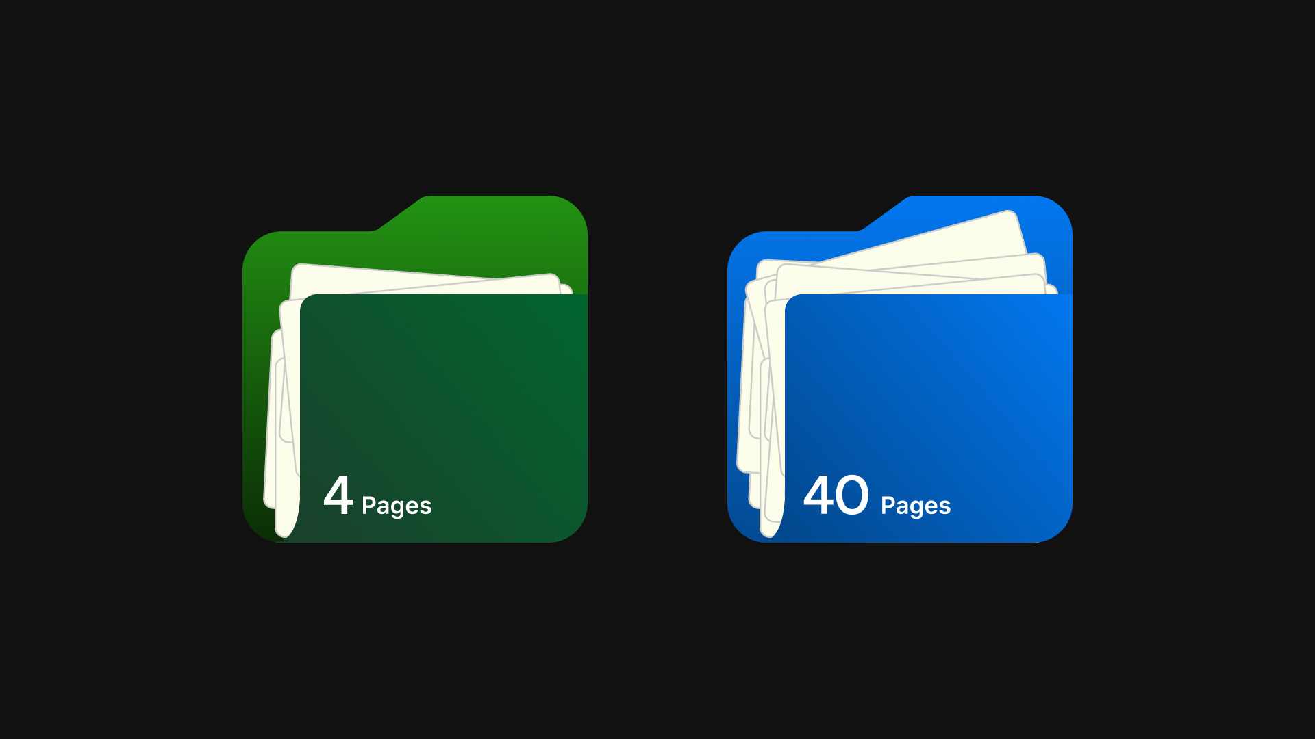
Four pages or forty
The right length depends on who will read the document, not on how much work went into the identity.
A café, a three-person consultancy or an independent shop has perhaps two people who will ever touch the logo: the owner and whoever does the social media. They need to know which file to use, which colours, which fonts and the handful of things not to do. That fits in four to eight pages, and anything longer will not be read.
A company with a marketing team, an external agency, franchisees or resellers needs more, because more people are making decisions without you and they need the reasoning as well as the rules. Tone of voice, photography direction, layout systems and templates earn their place because someone will apply them. That is the forty page document, and it is the exception for most freelancers.
Start from the short version and add sections only when a specific person at the client will use them. A section nobody applies is not thoroughness, it is noise that hides the rules that matter.
The sections that always matter
Five sections appear in every set of guidelines, whether the client is a one-person practice or a listed company.
Logo and variants
Show the full logo, the logomark and the logotype, and each lockup the identity has, in full colour, black and white, and say when each is used. Name the file for each variant, using the same names as the delivered files, so the guideline and the folder agree. If a variant is restricted, say so here.
Clear space and minimum size
One diagram covering both. Define clear space as a proportion of the logo itself, typically the height of the mark or of a letter, and show it on all sides. Give the minimum size in millimetres for print and pixels for screen, with a separate figure for the logomark if it can go smaller.
Colour
The palette with every value someone might need: HEX for web, RGB for screen documents, CMYK for print and Pantone where the brand will be reproduced as spot colour. Name each colour, mark the primary, and state which combinations of text and background are permitted, because contrast is where most palette mistakes happen.
Typography
The typefaces, the weights in use and what each is for: headings, body, captions. Where to obtain them and which licence the client needs, since yours does not transfer. A fallback for office software. A specimen at real size is worth more than a paragraph of description.
Usage do's and don'ts
Six to ten rules, each shown as a picture, each one a mistake you have seen someone make. Do not stretch, recolour, add effects, place on busy imagery, rebuild the lockup or rotate. Pair each don't with the correct alternative so that the page teaches rather than only forbids.
The sections that only matter sometimes
These sections are valuable when a specific person will use them and clutter when nobody will.
Tone of voice
Include it when the client produces written content regularly and more than one person writes it: a marketing team, a content agency, a founder plus a copywriter. For a client whose writing is one person's emails, a paragraph of principles is plenty.
Imagery and photography
Include it when the brand commissions or selects photography regularly. Show examples of what fits and what does not, and give practical direction: lighting, colour treatment, subject, crop.
Iconography
Include it when you designed an icon set, or when the client will need icons on a website or in an app. Name the set, show the grid and stroke weight, and say where to get more.
Motion
Include it when the logo will be animated for video, social or an app splash screen. A few frames and a note on timing and easing prevent a badly bouncing logo.
Social templates
Include them when they were part of the scope, and deliver them in the tool the client uses rather than as Illustrator files. Without templates in scope, a single page showing the square avatar and the rules for placing the logo over images is enough.
Co-branding, stationery, signage, packaging and vehicle livery follow the same test: if someone at the client will make one of those things in the next year, write the section. If not, leave it out.
How to write rules that people follow
Guidelines fail when they are written like a report. They are opened by someone with a task and thirty seconds, so write for that person.
Keep every rule short. One sentence of instruction, one image showing it, one line of explanation if the reason is not obvious. If a rule needs a paragraph, it is probably two rules.
Make it visual. A picture of the logo on a busy photograph with a cross through it does more than any sentence about background contrast. Wrong examples are remembered longer than right ones, so show both.
One rule per page, or per clearly separated block. When a page contains five rules in running text, the reader keeps only the first.
Drop the jargon. Your reader does not know what a lockup, a reversed logo or leading is. Say "the version with the symbol above the name" and "the white logo for dark backgrounds".
Put file names next to rules. When the page about the white logo says which file to open, the rule gets applied. Otherwise the reader asks you, or worse, improvises.
Keeping the document current
Guidelines drift out of date the day a colour is adjusted or a font is swapped, and a PDF cannot be recalled. The old version keeps circulating, and eventually the printer works from it.
Two habits help. First, version the document: a number and date on the cover and a short change log inside, so anyone holding two copies can tell which is current. Second, keep a single canonical location and send people the link rather than the file. When the guidelines change, the link does not.
A hosted brand page takes this further. Colours, fonts, logo downloads and the rules live at one address, and the client and their suppliers always see the current version. If the guidelines are generated from the Illustrator file, as with the Apply Changes button in Anchr Guide, a colour change in the file updates the document instead of forcing a rebuild.
Sections at a glance for freelance projects
| Section | Include it | Notes |
|---|---|---|
| Logo and variants | Always | Match names to the delivered files |
| Clear space and minimum size | Always | One diagram, print and screen sizes |
| Colour | Always | HEX, RGB, CMYK; Pantone when spot colour is used |
| Typography | Always | Weights, purposes, licence, fallback |
| Usage do's and don'ts | Always | Six to ten, shown visually |
| Which file when | Always | Often the most used page |
| Social avatar and placement rules | Sometimes | For any client active on social |
| Tone of voice | Sometimes | When more than one person writes |
| Imagery and photography | Sometimes | When the brand uses photography regularly |
| Iconography | Sometimes | When an icon set exists or is needed |
| Stationery and templates | Sometimes | When in scope |
| Co-branding | Rarely | Partnerships, sponsorships, franchises |
| Motion | Rarely | Video-led brands and apps |
| Signage, packaging, livery | Rarely | Only when the client makes these things |
Questions
How long should brand guidelines be for a small business?
Between four and twelve pages for most freelance clients. That covers the logo and its variants, clear space and minimum size, colour, typography, the do's and don'ts and the file guide. Add a section only when a named person at the client will use it. A short document that gets opened beats a long one that does not.
Should I charge separately for brand guidelines?
Treat the short version as part of every identity project, because without it the identity will not be applied correctly. The longer sections, such as tone of voice, imagery and templates, are additional work and should be scoped and priced as such. Either way, list the guidelines as a line item so the client sees what they are getting.
Is a PDF or a web page better?
A PDF is familiar and prints well, but it cannot be updated once sent, so old copies keep circulating. A hosted page stays current at a fixed link and lets people copy colour values and download files directly. For most clients the best answer is both: a page as the canonical reference, and a PDF for anyone who needs a document.
What if the client changes a colour after delivery?
Update the master file first, then the guidelines, then the delivered logo files, and tell the client which version is current. This is where a versioned document and a single link earn their keep, because a colour change that only lives in an email will be missed by the next printer.
Do it in one click
Anchr Guide, one of the five tools in the Anchr Tools Illustrator extension, fills one of three brand guidelines templates, Atlas in 20 pages for the full guidelines, Folio in 12 pages, or Narrow in one page for the summary, from the open file: the brand name from the document name, up to six colours from named swatches with HEX, RGB and CMYK written out, the fonts in use for header, subheader and body, and the logomark, logotype and full logo from your selection. Its Voice and rules section covers what a file cannot hold: a tone of voice from six presets, each a one-line summary and five principles you can rewrite, a minimum size for each logo version, and do's and don'ts prefilled with standard rules. Folio writes each of these, and the clear space rule, on its own page of the guidelines; Atlas prints the minimum sizes on its Minimum Size page. The output is a PDF that also opens in Illustrator. When a colour or font changes, Apply Changes updates the open guidelines document. Anchr Portal then publishes the same brand as a hosted page at a fixed link, with the tone of voice and the usage rules set in Guide, whatever the template. See /guide and /portal.
For a client who only needs the essentials on one page, the free brand guidelines generator lays out the logo on light and dark, the palette with HEX, RGB and CMYK, the typefaces and the clear space and minimum size rules, and exports a PDF from your browser.