
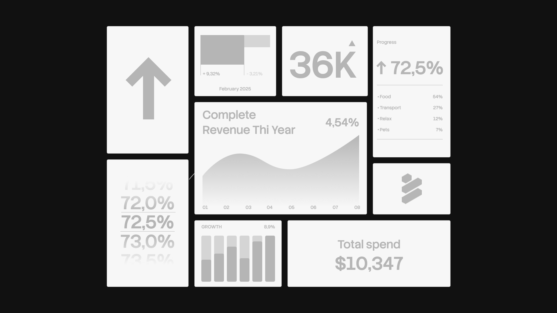
A logo reveal has one job: show the mark, the colours and the type together so that a client understands the system in a single look. The bento layout does this better than a slide sequence because it puts everything on one surface with a visible hierarchy. It has become the default for identity case studies on Behance and Dribbble, and like every default it is easy to do badly. These are the rules that keep it clean, the sizes for each platform, and how to build one by hand in Illustrator.
What a bento layout is
A bento layout is a set of rounded rectangles of different sizes sitting on a shared grid with one consistent gutter between them, the way compartments sit in a Japanese lunch box. The pattern was borrowed from product marketing pages, where a feature list became a mosaic of cards: one large cell for the headline, smaller ones for details. In brand work the cells hold the parts of an identity instead of features.
The three properties that make it a bento and not just a collage: the cells share one base grid, the gutter is identical everywhere, and the corner radius is the same on every cell.
Why it works for a brand reveal
Hierarchy in one glance. The largest cell is read first, so the mark or the wordmark gets the attention before anyone sees a colour chip. Room for everything: the mark, the palette, a type specimen and a mockup fit on one canvas without a slide change. Contrast built in: a filled cell next to an empty one reads as intentional, so a single-colour cell can carry as much weight as a photograph. And it survives cropping. A bento reads on a phone because each cell is a small composition of its own.
Layout rules
One hero cell. Exactly one cell is clearly larger than the rest, and it holds the primary logo. Two heroes cancel each other out.
Consistent gutter. Pick one value and use it between every pair of cells and as the outer margin. On a 1600 px canvas, 16 to 24 px is typical; on a print page, 4 to 6 mm.
A corner radius that matches the mark. If the logo is built on circles, a generous radius fits; if it is built on sharp geometry, keep the radius small. The radius should be the same on every cell regardless of the cell's size, so a small cell never looks rounder than a large one.
Five to nine cells. Fewer than five and the layout reads as a poster; more than nine and nothing is a hero.
Alignment to a base grid. Every cell edge sits on a column or row of one underlying grid, usually 4, 6 or 12 columns with matching rows. A cell spans whole units, never half.
Contrast between filled and empty. Roughly a third of the cells should be quiet: a flat colour with one small element, or a large type character on empty space. If every cell is busy, the eye has nowhere to rest.
What to put in each cell
| Cell | Content | Notes |
|---|---|---|
| Hero | Logomark or full lockup on the primary colour | Largest cell; centre it and respect the clear space |
| Wordmark | Wordmark alone, on white or the darkest colour | Wide cell, 2 by 1 or 3 by 1 units |
| Primary colour | One flat fill with the name and HEX | Small square; nothing else in it |
| Secondary colours | Two to four stacked or side by side chips | One cell, not one cell per colour |
| Type specimen | Family name, two weights, a line at text size | Set real words, not a lorem block |
| Pattern | Repeating motif from the mark | Full-bleed inside the cell |
| Mockup | One object: a card, a sign, a bag | One is enough; keep photography consistent |
| Tagline | Short line in the display face | Small cell or the leftover unit |
A full set fills eight or nine cells; a compact reveal uses five: hero, wordmark, primary colour, type specimen, mockup.
Sizes for each platform
Behance displays project images at 1400 px wide in the project view and up to 2800 px in the lightbox, according to its help centre, so build the canvas at 2800 px wide and export at 1x. Height is free; a 2800 by 2100 canvas (4:3) is a good default for one bento.
Dribbble recommends a minimum width of 1600 px for images and no longer restricts the ratio or height, with a 10 MB limit for images, according to its help centre. The classic 4:3 shot at 1600 by 1200 still frames a bento well; export at 3200 by 2400 for a sharp result.
Instagram sizes feed images to 1080 px wide and keeps the original resolution for ratios between 1.91:1 and 4:5, according to its help centre, which puts the tallest post at 1080 by 1350. Build the bento at 2160 by 2700 and remember that the profile grid crops, so keep the hero cell in the middle.
A case study page on your own site depends on your column width. A common choice is 1600 px wide at 2x for a 800 px column, or 2400 px for a 1200 px column, saved as a compressed PNG or a WebP.
Design the layout once at the widest ratio, then re-flow the same cells for the tallest. Because every cell sits on a base grid, moving from 4:3 to 4:5 is a matter of stacking rather than redesigning.
How to build it by hand in Illustrator
- Draw the base rectangle at the final size and fill it with the background colour. Lock it on its own layer.
- Set up the grid with Object > Path > Split Into Grid on a copy of the base rectangle, entering rows, columns and the gutter value; it is the quickest way to get evenly spaced cells.
- Merge cells into the sizes you want: select adjacent cells, draw one rectangle to their outer edges and delete the originals. Keep the hero at 2 by 2 units or larger.
- If you built the cells without a gutter, select all of them and run Object > Path > Offset Path with a negative offset of half the gutter (for a 20 px gutter, minus 10 px on each cell), then delete the originals.
- Round the corners with Effect > Stylize > Round Corners for a live, editable radius across the whole selection, or drag the live corner widgets with the Direct Selection tool. Use one value everywhere.
- Check alignment with the Align panel: align to the artboard, then use Distribute Spacing with the gutter value typed in so the gaps are identical.
- Place artwork with clipping masks: draw the artwork over a cell, select both, Object > Clipping Mask > Make. Logos go in with Paste in Place and then Align to the cell.
- Name the layers: Base, Cells, Content, Guides. You will re-flow this file for the next platform size.
Step 4 is where most hand-built bentos go wrong, because an offset applied per cell is exact and a gutter dragged by eye is not.
Common mistakes
Too many cells. Twelve cells at 1600 px wide gives you thumbnails, not a presentation. Cut until the hero is obvious.
Radius too large. A 60 px radius on a 200 px cell turns it into a pill and fights any mark with straight edges. Keep the radius under a tenth of the smallest cell's short side.
Cells that do not share a grid. Two cells that almost line up are worse than two that clearly do not. Snap every edge to the base grid and check it at 400 percent.
A gutter that changes. One 20 px gap next to one 24 px gap is visible even to a client who cannot say why the layout feels off.
Mockup overload. Three product photos in one bento turn a system reveal into a catalogue. One mockup, one angle.
Colour chips with no values. A chip without a HEX is decoration; the client will screenshot it and sample the wrong colour.
Questions
How many cells should a logo reveal have?
Five to nine. Five covers the essentials: hero, wordmark, primary colour, type and one mockup. Nine adds secondary colours, a pattern, a tagline and a second lockup. Beyond nine, cells become thumbnails and the hero stops reading as a hero, which defeats the point of the layout. When in doubt, remove a cell and enlarge the rest.
What corner radius should I use?
Match the mark. Start at 2 to 4 percent of the canvas width and adjust: a rounded logo tolerates the upper end, a geometric one wants the lower end. Keep the same radius on every cell whatever its size. On a 1600 px canvas that is 32 to 64 px; on an A4 page, 4 to 8 mm.
Should the bento use the brand colours or a neutral background?
Use a neutral base (white, off-white or the darkest brand colour) and let the cells carry the brand colours. A base in the primary colour competes with the primary colour chip and with the hero cell. Two or three filled cells against a neutral base are enough to make the palette read.
Can the same bento work for Behance and Instagram?
Yes, if the cells share a base grid. Design at 4:3 for Behance and Dribbble, then stack the same cells into 4:5 for Instagram, keeping the hero in the middle because the profile grid crops the top and bottom. Re-export rather than resize, so type in the cells stays sharp at each width.
Do it in one click
Anchr Deck builds the cell structure inside Illustrator. Select a base rectangle, choose Simple, Centered, Brick or Random, set Sections from 3 to 12, Corner Radius from 1 to 500 px and Gutter from 1 to 200 px, and press Shuffle until the arrangement suits the mark. Finalize commits the cells to a "Bento Grid (Finalized)" layer; they inherit the base rectangle's fill, so the gutter and radius are identical on every cell by construction. You then place your logos, colours, type and mockups in the cells as usual. Deck does not export or share anything by itself; it saves the measuring, offsetting and rounding steps described above and leaves the design decisions to you. It is part of every Anchr Tools plan, see pricing.