
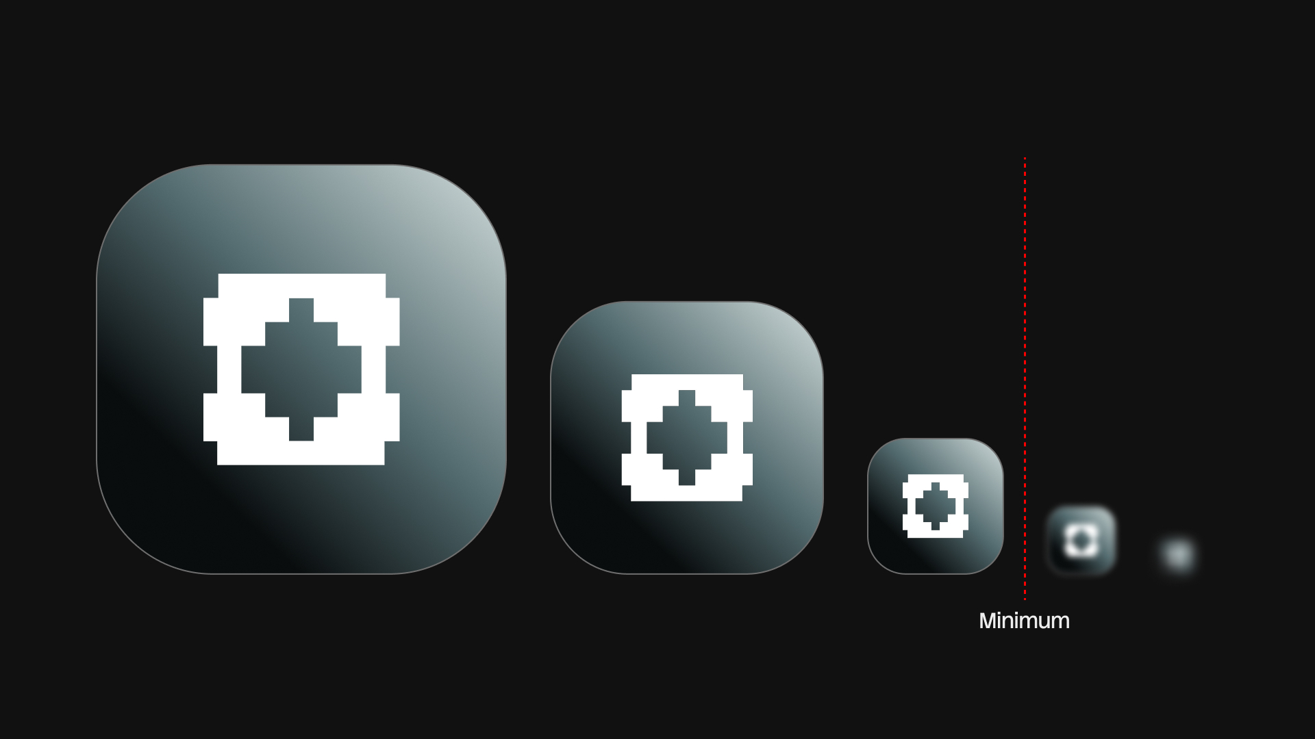
Every logo has a size below which it stops working. The wordmark blurs into a grey bar, the counters fill in, the thin joins between strokes disappear, and what was a mark becomes a smudge. Minimum size is the rule that says where that happens. Most guidelines state one, and many of those numbers were guessed. This article covers why the limit exists, how to find it with tests rather than convention, what to do when a logo fails small, how to document the rule, and how to set up the test artboards in Illustrator.
Why a minimum size exists
Four things go wrong as a logo shrinks, at different sizes.
The wordmark loses legibility first. Letter spacing that felt generous at 80 mm closes up, and at 15 mm the eye reads a shape, not a word. Condensed and light typefaces fail earlier than wide, regular ones.
Thin strokes drop out. A hairline that is 0.5 pt at presentation size becomes 0.05 pt at a tenth of that, which no printing method holds. Reversed-out hairlines fill in even sooner, because ink spreads into the gap rather than away from it.
Counters and small negative shapes close: the inside of an a, an e or a g, the gap between symbol and wordmark, the slit that makes a shape read as two forms. These details decide whether a mark stays itself.
Print adds dot gain. Ink spreads on paper, more on uncoated stock than on coated, so every edge grows outward and every gap shrinks. A logo that survives on a laser proof can still fail on newsprint. Screens have no dot gain, but they have anti-aliasing: below a certain size, edges fall between pixels and lose contrast.
Because these failures depend on the shape of the mark, the minimum size is a property of each lockup, not of the brand. A symbol may hold at 6 mm while the horizontal lockup needs 25 mm.
Find it empirically
A test sheet takes half an hour and gives you a number you can defend.
Print tests
Place the logo at a series of widths on one sheet: for a horizontal lockup something like 40, 30, 25, 20, 15, 12 and 10 mm, and a tighter series for the symbol alone. Include the reversed version on a solid panel. Print at 100% on the paper the brand will actually use, or ask the printer for a proof on the real stock. An office laser printer on smooth paper is optimistic; if the brand will live on uncoated business cards, test on uncoated card.
Look at the sheet from normal reading distance, then close up. Note the first width at which any counter closes, any stroke breaks, or the gap between symbol and type becomes ambiguous. The minimum is one step above that.
Screen tests
Export the same series in pixels at 1x and 2x, and view the files at 100% on a standard density display as well as a high density one. The 1x rendering on a standard display is the worst case, and it still exists on plenty of desktop monitors. Test widths you expect in interfaces: 200, 150, 120, 100, 80 and 60 px for a lockup. Check that strokes stay one full pixel or more at 1x; half-pixel strokes render grey.
The favicon test
Place the symbol in a 32 by 32 px square and a 16 by 16 px square and export at 1x. Most lockups fail here outright, many symbols fail at 16, and some brands need a dedicated favicon glyph that is not the logo at all. This test tells you whether the logomark can be the smallest expression of the brand or whether you need to design one.
What you are looking for
Work through the sheet with a short checklist: every counter still open; every stroke still a stroke, not a series of dots; symbol and wordmark still read as two elements with a gap; the reversed version not filling in; the word still legible without knowing what it says.
Conventions for stating the number
Guidelines state minimum size by width, because width is the value people set in a layout, in millimetres for print and pixels for screen. A single number for "the logo" is not enough. Give a separate minimum for each lockup you supply: the logomark alone, the horizontal lockup and the stacked lockup, and for the reversed version if it fails earlier.
You will see figures like 20 mm and 100 px repeated across guidelines. Treat them as a starting point for the test sheet, not as the answer.
An example, for a fictional brand:
| Asset | Print minimum (width) | Screen minimum (width) | Below this |
|---|---|---|---|
| Horizontal lockup | 30 mm | 140 px | Use the stacked lockup or the logomark |
| Stacked lockup | 20 mm | 90 px | Use the logomark |
| Logomark | 8 mm | 32 px | Use the favicon glyph |
| Favicon glyph | Not for print | 16 px | Do not use |
The last column is what most guidelines leave out, and what stops people shrinking the lockup anyway.
When a logo fails at small sizes
Two answers, and often both.
A small-size variant is a redrawn version for use below a stated width: strokes thickened, counters opened, fine detail removed, letter spacing increased, and sometimes the gap between symbol and wordmark widened. It should look identical to the main logo at a glance and measurably different under a loupe. Document the switch point, for example "use the small-size version below 25 mm or 120 px", and supply it as a separate file so nobody has to choose by eye.
A logomark-only fallback is simpler: below the lockup's minimum, the wordmark is dropped and the symbol stands alone. It works when the symbol is established enough to carry the brand, and it needs its own minimum in turn.
Below the logomark's minimum, the answer is a favicon glyph or nothing. Guidelines should say so.
Document it in guidelines
Two elements make the rule usable.
A diagram at actual size. Show each lockup at its print minimum on the page, with a dimension line and the value, so a reader can put a ruler on it. Keep the page at 100% in the PDF; a minimum size diagram that has been scaled to fit a layout is a contradiction. Add the screen minimum next to it as a value only, since a PDF cannot show pixels honestly.
A table by use case. Business card, letterhead, pen, app icon, website header, email signature, social avatar: state which asset to use and its minimum for each. Most people looking up the rule have a specific job in hand and want the row, not the principle.
Pair minimum size with clear space on the same spread. They are the two rules that protect the mark in other people's layouts, one a floor on its size, the other a multiple of its dimensions.
Set up the test artboards in Illustrator
Two files, one per medium. Colour mode is set per document, so a print sheet in CMYK and millimetres and a screen sheet in RGB and pixels are cleaner as separate files.
For the print file, create an A4 or Letter artboard in millimetres with File > Document Setup or the Artboards panel (Window > Artboards). Place the final logo and scale copies by typing widths into the W field of the Transform panel (Window > Transform) with the proportions lock on. Caption each copy with its width, and add a black panel with the reversed version at the same widths. Print with File > Print, Scaling set to Do Not Scale, on the real stock. View > Actual Size (Cmd+1, Ctrl+1 on Windows), with Display Print Size at 100% Zoom enabled in Illustrator > Settings > General (Edit > Preferences > General on Windows), previews the physical size on screen roughly: useful for laying out the sheet, not a substitute for the print.
For the screen file, create a new document from the Web preset, which is RGB and in pixels, and switch on View > Pixel Preview (Option+Cmd+Y, Alt+Ctrl+Y) so you see the anti-aliasing as it will render. Snap the copies to whole pixel positions and check that the smallest strokes are at least one pixel wide at 1x. Export with File > Export > Export for Screens (Option+Cmd+E, Alt+Ctrl+E), adding 1x and 2x scale entries, and open the PNGs in a browser at 100%. For the favicon test, add 32 and 16 px artboards with the symbol filling them and export at 1x.
Keep both files with the master logo file. When the logo is revised, run the sheets again; a redrawn join or a lighter weight can move the minimum by a few millimetres.
Questions
Should minimum size be stated by width or by height?
By width for lockups, because width is the value people set when they drop a logo into a layout, and by height for logomarks that sit in a row with other symbols, such as partner logo strips. Whichever you choose, say which dimension the number refers to and draw the dimension line on the diagram.
How different are the print and screen minimums?
They are different limits, not conversions of each other. Print is limited by ink spread and by what the eye resolves on paper, screen by pixel rendering at 1x. A logo can hold at 12 mm in print and need 100 px on screen; the two are not equivalent. Test both, state both, and never derive one from the other with a resolution formula.
Does the reversed logo need its own minimum?
Often, yes. Reversed-out strokes and counters fill in earlier in print because ink spreads into the white shapes, and light-on-dark type on screen looks heavier and blurs sooner at small sizes. If the reversed version fails a step earlier on the test sheet, state a separate minimum or, more simply, state the higher value for both.
Is a small-size variant the same as a responsive logo?
Not quite. A responsive logo system usually has several stages, dropping elements as space shrinks, and is chosen by layout width. A small-size variant keeps every element and adjusts their drawing so they survive reproduction. Many brands need only the variant; the responsive system makes sense when the lockup is genuinely long.
Do it in one click
Minimum size and clear space are the two rules that keep a logo intact in other people's layouts, and both belong on the same guidelines spread. Anchr Grid draws the clear space guide from the selected mark: the exclusion zone at X, the optimum at X/2 and the minimum at X/4, each on its own named layer, without touching the artwork, and records the measurement in the document. Anchr Guide fills one of three brand guidelines templates, Atlas in 20 pages, Folio in 12 or Narrow in one, from the open file: brand name, up to six named swatches in HEX, RGB and CMYK, the fonts in use and the three logos from the selection. Its Voice and rules section takes a minimum size for each logo version, in mm for print and px for screen. Folio gives each rule its own page: the clear space, stated from Grid's measurement, with a diagram, then the minimum size, with each version's print and screen size. Atlas writes the minimum size rule and each version's size on its Minimum Size page. Whatever the template, both rules appear in the Usage section of the brand portal. The output is a PDF that opens in Illustrator, so the minimum size diagram from your test artboards can go in next to the logos. See Anchr Grid and Anchr Guide.